Building a Multi-Currency Luxury Storefront on Shopify 2.0
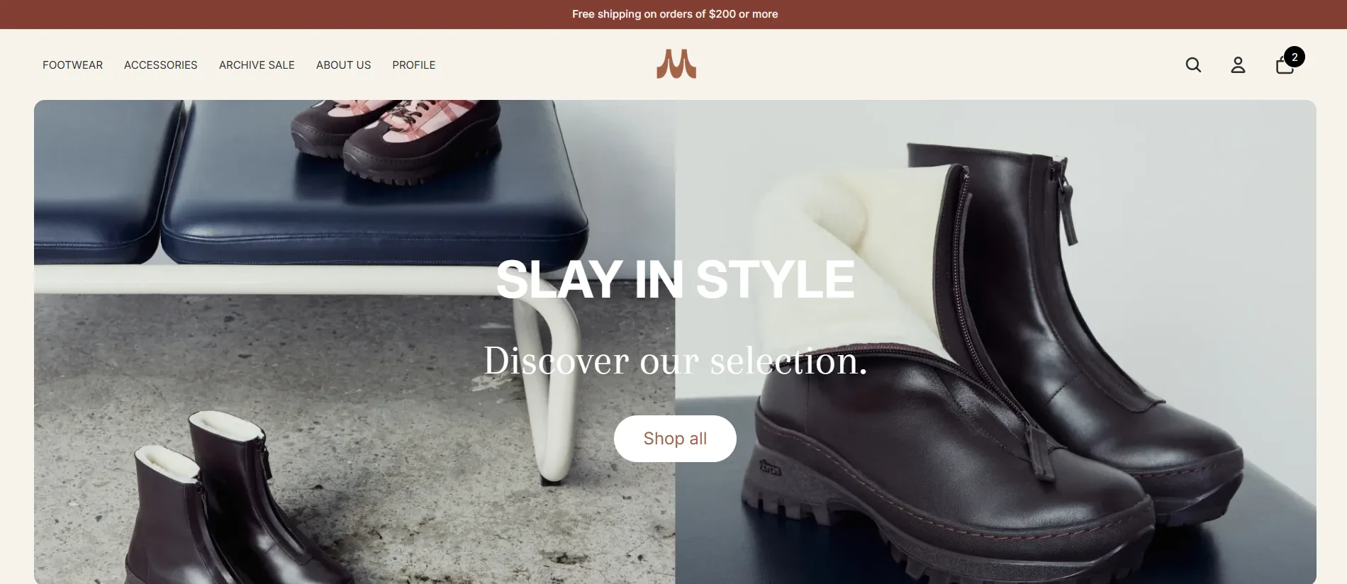
Maguire Leathers is a premium Canadian women’s footwear brand — the kind of client where “just use a theme” isn’t an option. The brief called for something that felt editorial, moved fast, and handled customers in multiple currencies without friction. Here’s how I built it.
The Brief
The brand had outgrown their previous Shopify setup. Their existing theme was generic, slow, and couldn’t support the editorial storytelling their marketing team wanted to do. The core requirements were:
- Multi-currency — CAD, USD, and GBP at minimum, with correct formatting per locale
- Product carousels — merchandising-driven sections the team could update without touching code
- Archive sale — a dedicated sale experience separate from the main collection
- Editorial layouts — full-bleed imagery, editorial typography, the feel of a luxury print lookbook online
- Performance — under 2s load time on mobile, no compromise
Design Decisions
Luxury DTC lives and dies on first impressions. I kept the homepage layout sparse — a lot of negative space, large serif type, and product photography that fills the screen. No carousels on the hero. A single, confident statement per section.
The colour palette is warm off-white (#FAF7F2) against a near-black nav bar. This contrast gives the product imagery somewhere to breathe while keeping the brand grounded and premium. Navigation is minimal: four links, a currency switcher, and a cart icon — nothing to distract from the product.
For typography I used a large serif for headings (scaled with clamp() so it reads well from mobile to wide desktop) and a clean sans for body and UI. The sizing hierarchy is deliberate: product names get the serif treatment; prices, labels, and tags stay in the sans.
Technical Deep-Dive: Multi-Currency in Liquid
Shopify Markets handles the heavy lifting here — currency conversion, formatting, and checkout. But the UX around it needs to be built carefully. My implementation:
{% comment %} In the product price snippet {% endcomment %}
{% assign price = product.price | money_with_currency %}
{% assign compare = product.compare_at_price | money_with_currency %}

{% if product.compare_at_price > product.price %}
  <span class="price price--sale">{{ price }}</span>
  <s class="price price--compare">{{ compare }}</s>
{% else %}
  <span class="price">{{ price }}</span>
{% endif %}
The money_with_currency filter respects the active market — so a UK customer sees £95.00 while a Canadian customer sees CA$125.00, with no extra JavaScript needed.
For the currency switcher in the nav, I built a lightweight <form> that posts to /localization — Shopify’s built-in localisation endpoint. No JavaScript required for the switch itself, which keeps it fast and accessible:
<form action="/localization" method="POST" id="currency-form">
  <input type="hidden" name="_method" value="PUT" />
  <input type="hidden" name="return_to" value="{{ request.path }}" />
  <select name="currency" onchange="this.form.submit()">
    {% for currency in localization.available_countries %}
      <option value="{{ currency.iso_code }}"
        {% if currency.iso_code == localization.country.currency.iso_code %}selected{% endif %}>
        {{ currency.iso_code }} — {{ currency.name }}
      </option>
    {% endfor %}
  </select>
</form>
Product Carousel & Archive Sale Architecture
The product carousel is built as a Shopify 2.0 section with blocks. Each block is a collection reference — the merchandiser picks a collection in the theme editor and the section renders the first N products from it. This means zero code changes to update the carousel content.
{
  "name": "Product Carousel",
  "settings": [
    { "type": "text", "id": "heading", "label": "Heading" },
    { "type": "range", "id": "products_per_row", "min": 2, "max": 6, "default": 4 }
  ],
  "blocks": [
    {
      "type": "collection",
      "name": "Collection",
      "settings": [
        { "type": "collection", "id": "collection", "label": "Collection" }
      ]
    }
  ]
}
The archive sale section is a separate page template (page.archive.json) that loads a dedicated collection filtered by a sale tag. It renders a tighter grid with a sale badge overlay and a compare_at_price strikethrough — all controlled through metafields so the team can run it without a developer.
Performance Considerations
A luxury store with large photography has real performance pressure. My approach:
- Critical CSS — I inline the above-the-fold styles in
<head>and load the rest asynchronously - Lazy images — everything below the fold uses
loading="lazy"and explicitwidth/heightattributes to prevent layout shift - No app scripts on critical path — third-party reviews and chat widgets load after the
loadevent - Image sizing — Shopify’s CDN handles resizing; I pass explicit
widthparameters to theimg_urlfilter:{{ image | img_url: '800x' }}
The result is a Lighthouse performance score in the high 80s on mobile and above 95 on desktop.
Results & Takeaways
The store launched without issues and the Maguire team was able to self-manage content changes from day one — which was the whole point of moving to Shopify 2.0’s section/block architecture.
The biggest lesson from this build: on luxury stores, restraint is a feature. Every animation, every extra section, every font weight is a decision that either reinforces or dilutes the brand. When in doubt, I removed it.